How to delay startup applications on GNOME
Back in 2017, support for status icons, pictured below, was removed from GNOME Shell (v3.26).
This has been a controversial topic (as anything in the GNU/Linux community, really) and probably will always be, but in my opinion there's no point on discussing about it.
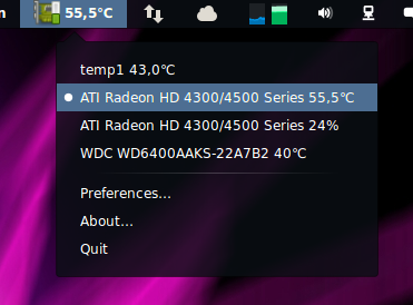
One way to use status icons on later versions of GNOME Shell is to install the (K)StatusNotifierItem/AppIndicator Support extension by Marco Trevisan. As you can see in the picture below, the menu is rendered natively by GNOME Shell instead of Qt/GTK+, so at the end of the day the desktop integration is much more seamless that the old implementation.
The only issue with this is that not all startup applications, those that are automatically started when you log in, that use status icons will show up in the bar. The reason for this, if I'm not mistaken, is that the applications are started before GNOME Shell/the extension is rendered.
How fix this
After Googling for a couple of minutes, the typical fix for this you'll find on any GNU/Linux forum is that you should add a sleep command before executing the application itself on the .desktop file (located in ~/.config/autostart/), like so:
[Desktop Entry]
Type=Application
Name=Nice App
Exec=bash -c "sleep 10 /opt/niceapp/niceapp -minimize"
Icon=niceapp
Comment=Just a nice application
This will effectively delay the startup process of the application for 10 seconds, giving GNOME Shell enough time to initialise before the application, resulting in its status icon showing in the top bar. This solution feels very hacky, though.
A few months ago I discovered that the "proper" way to do this is, however, to use the X-GNOME-Autostart parameters in your .desktop file instead:
[Desktop Entry]
Type=Application
Name=Nice app
Exec=/opt/niceapp/niceapp -minimize
Icon=niceapp
Comment=Just a nice app
X-GNOME-Autostart-Delay=10
X-GNOME-Autostart-enabled=true
From a UX point of view the result is essentially the same, but this solution is much cleaner in my opinion.

